FROM THE FARM ⋆✴︎˚
TO YOUR TABLE —
THE FARMER'S
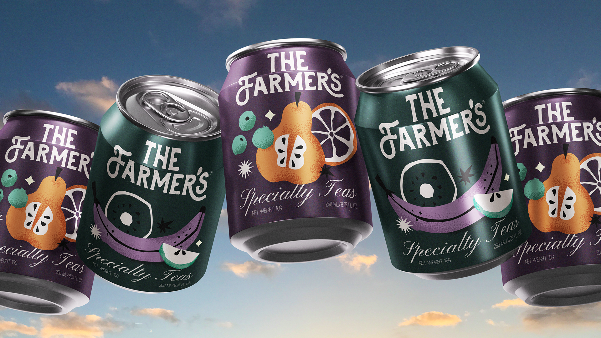
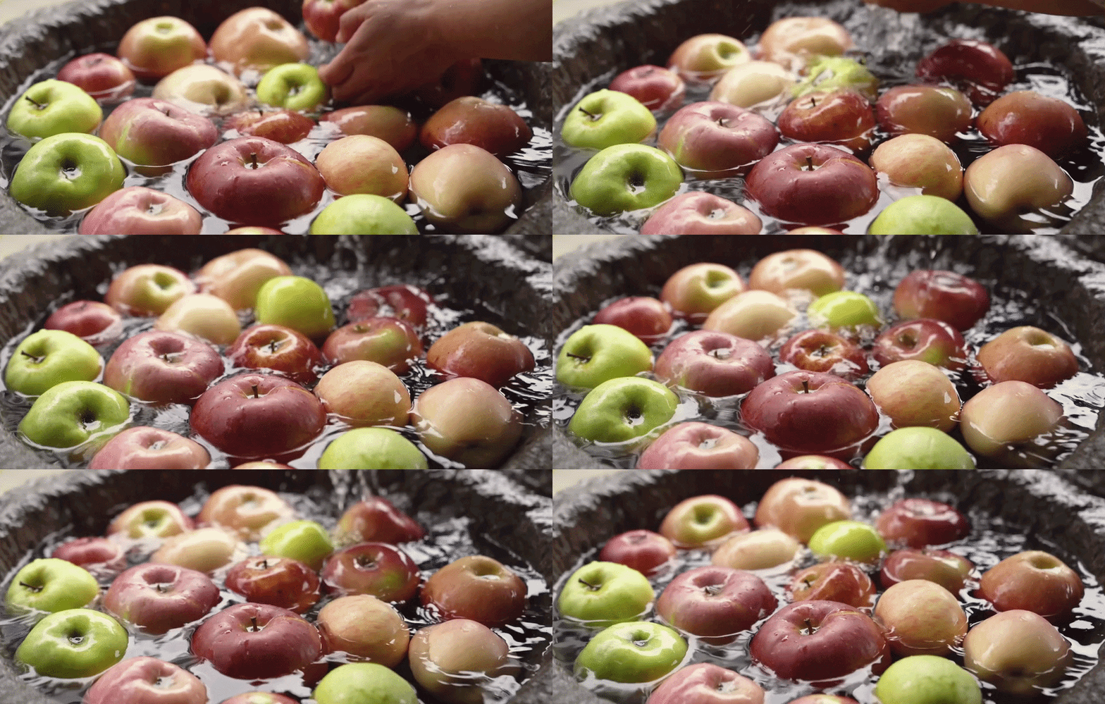
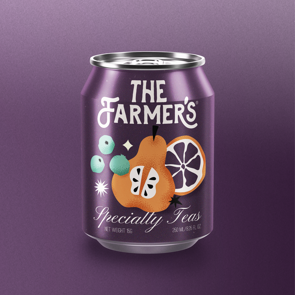
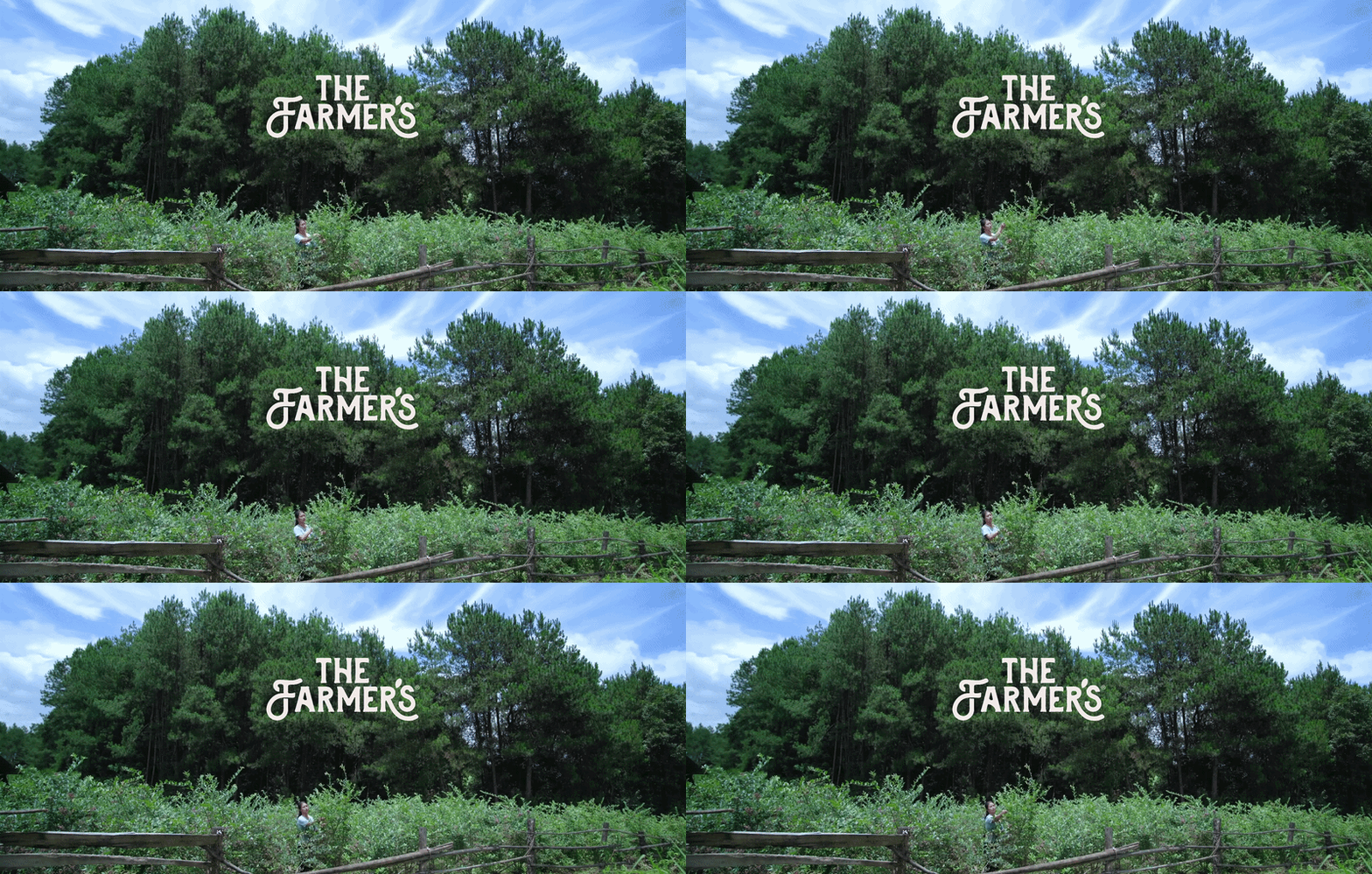
Tradeimpex Agro came to me with orchards, raw materials, and a question: what do we do with all of this? The answer was The Farmer's, a specialty tea brand built for people who want the real thing. Think Shams, think Esajees. Natural, considered, a little indulgent. The first product is a fruit-infused tea beverage in a can, and I developed the full brand identity around it.
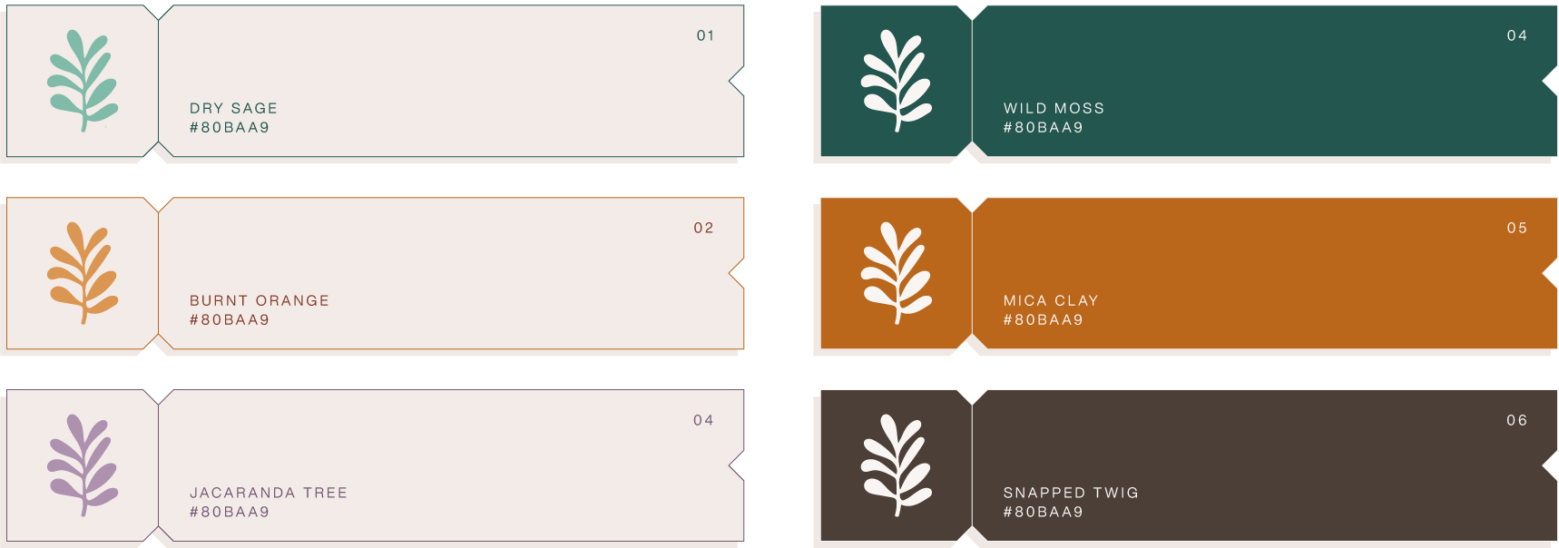
The palette came straight from the land. Dry sage, wild moss, burnt orange, mica clay. Nothing was picked to look trendy, it was picked to feel like somewhere real. The kind of colors you'd see walking through an orchard at the end of summer.
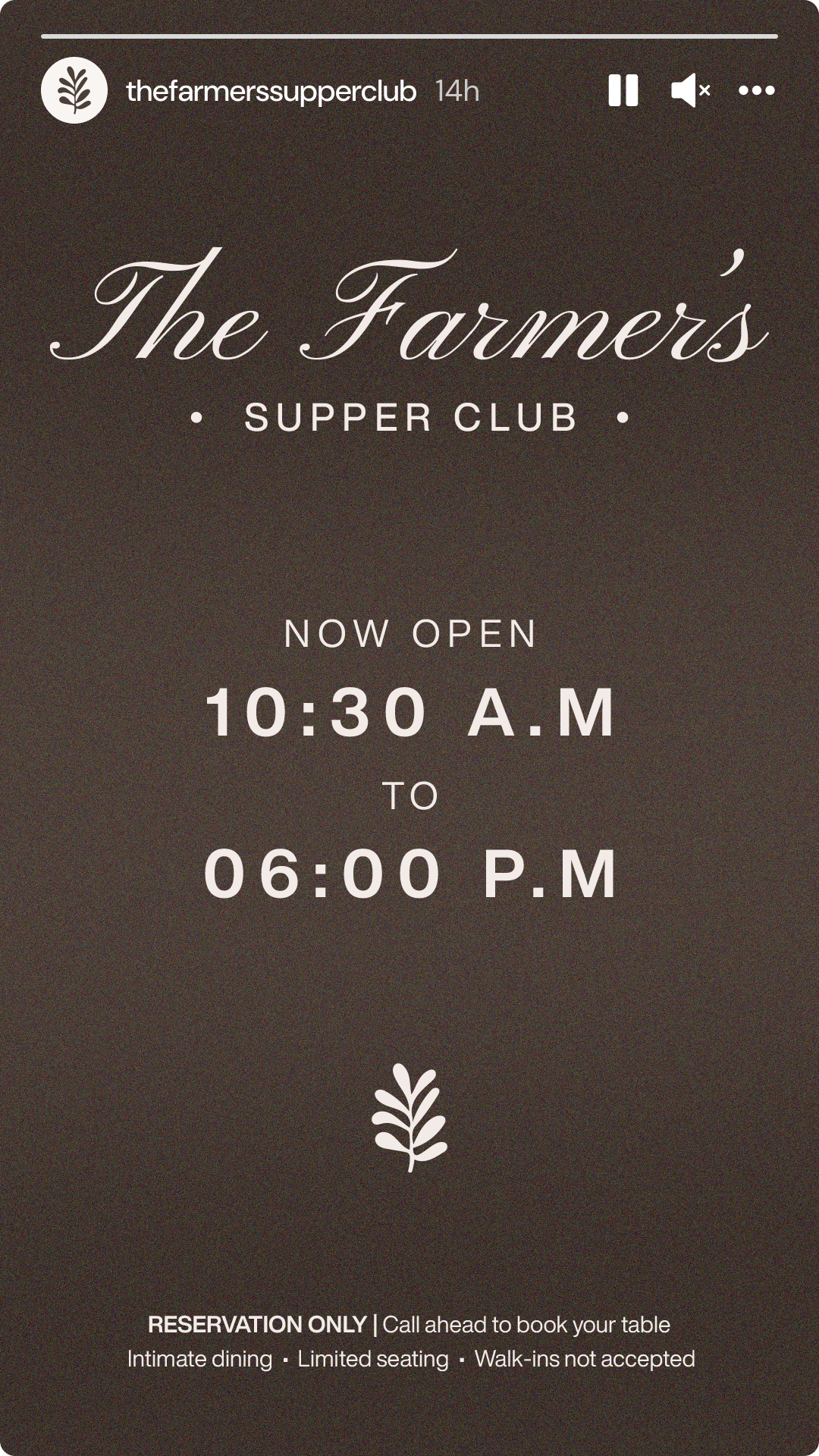
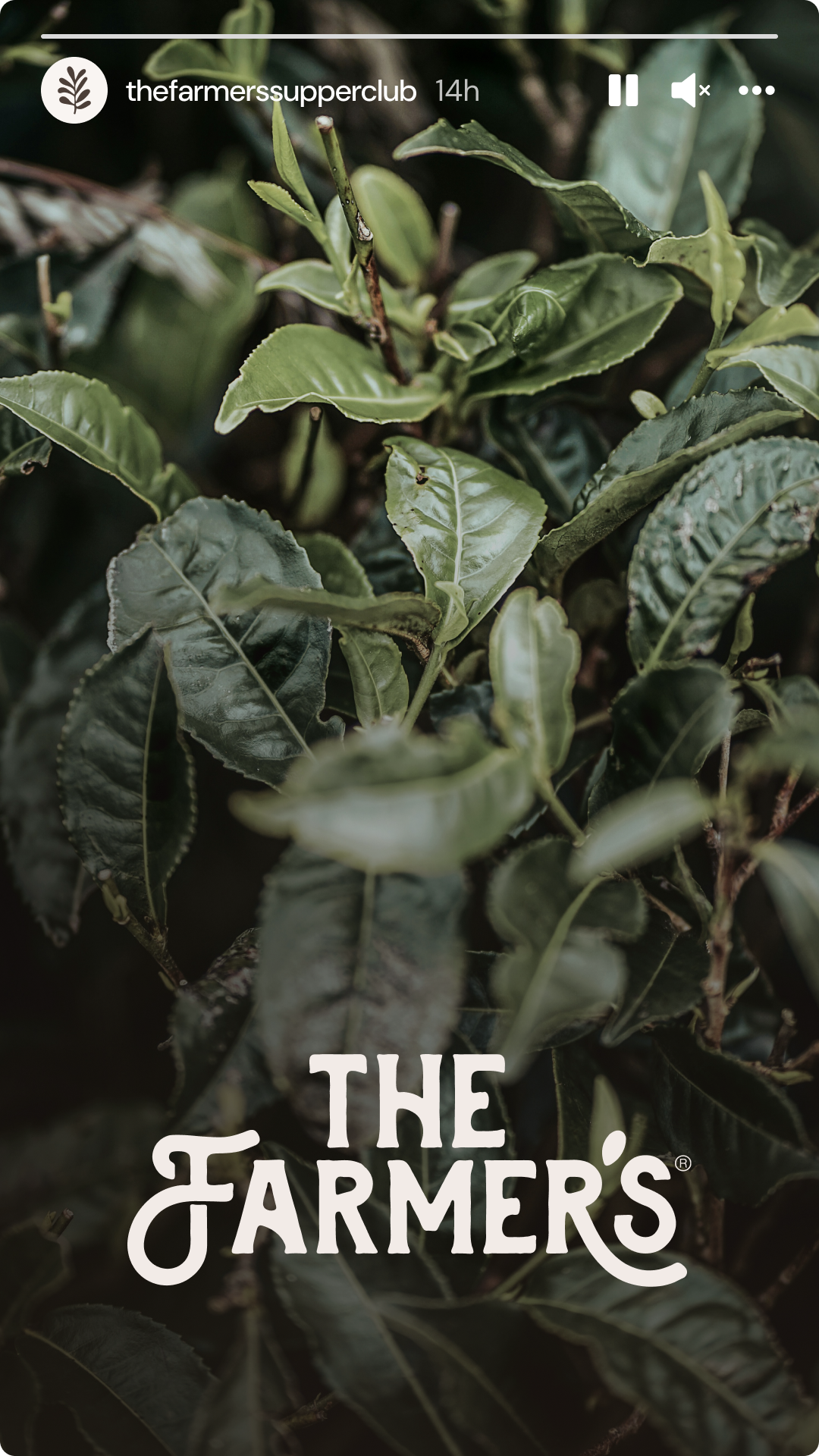
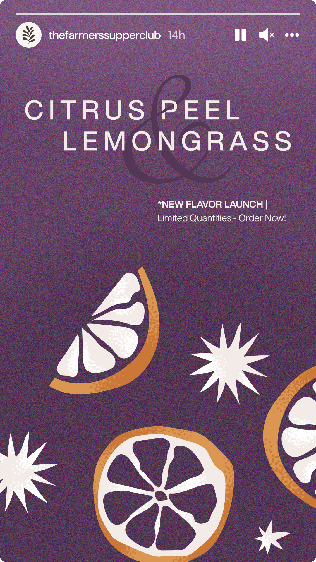
The Farmer's Supper Club is the community side of the brand, part loyalty concept, part test kitchen, part marketing idea for the farmers themselves. The social content needed to carry that same warmth. Reservation-only dining, new flavor launches, farm updates. Earthy and intimate, never corporate.
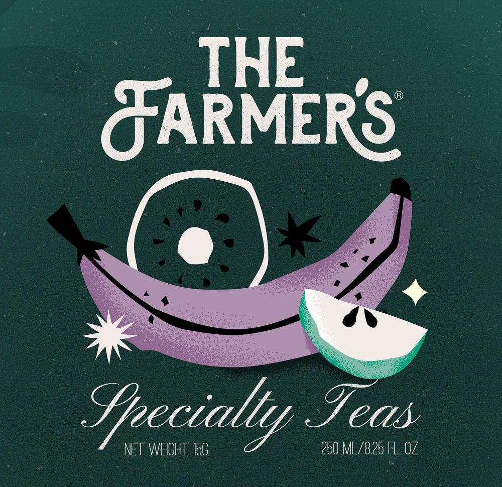
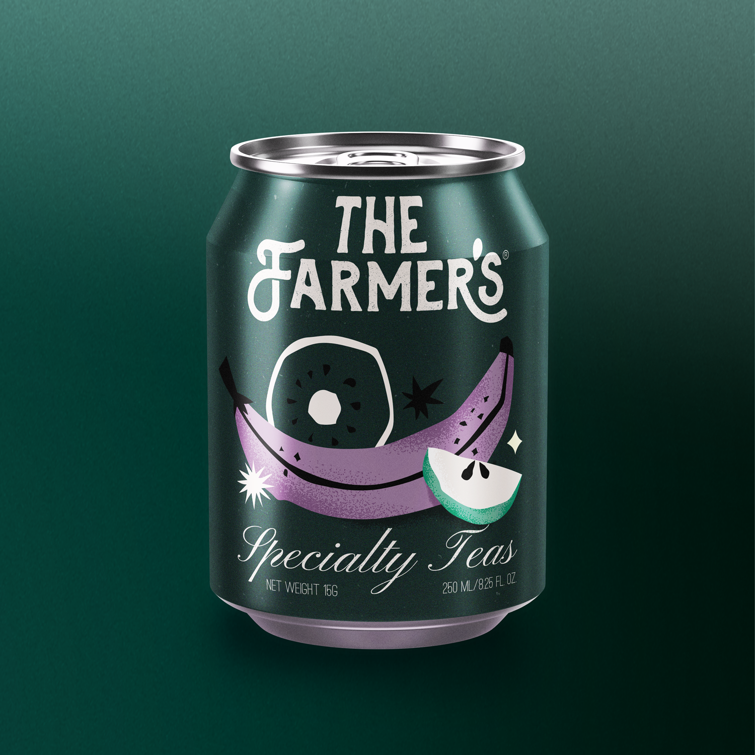
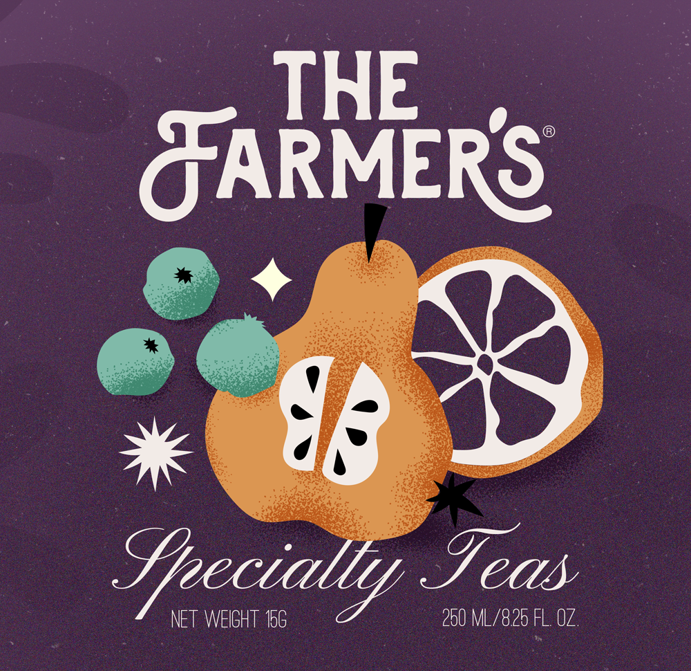
I did the illustrations myself, which was honestly the most fun part of this project. The fruit motifs on the cans are deliberately noisy, textured, a little imperfect, like something hand-picked rather than mass produced. That felt right for a brand whose whole identity is rooted in where things actually come from.
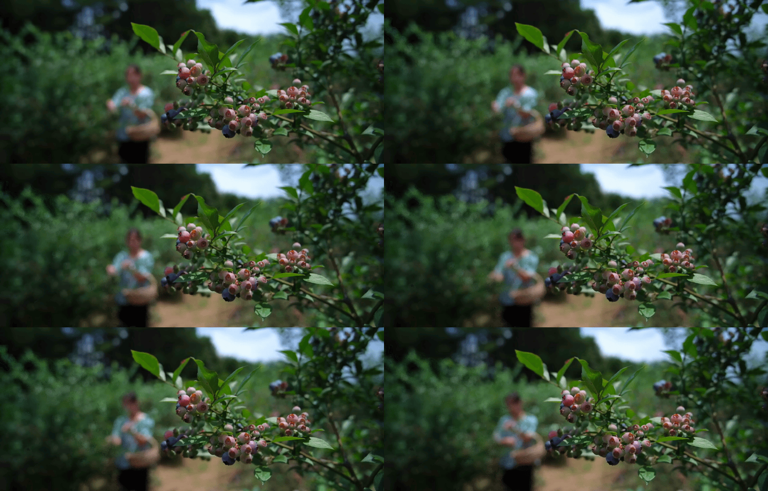
When your raw material is an orchard, the brand almost writes itself. The challenge was making sure the design lived up to it. Every choice, from the illustrated cans to the earthy palette to the supper club concept, had to feel like it genuinely came from the land. That kind of brief doesn't come around often and it was a pleasure to work on.
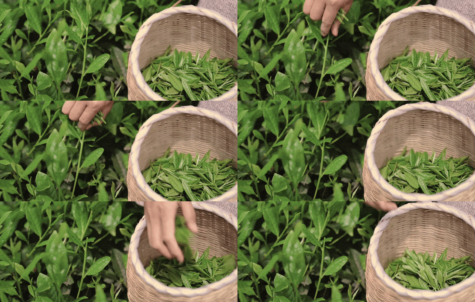
[GIF VISUALS SOURCED FROM LONGMEIMEI]