OATEN ✳
THE EVERYDAY OAT
This one came from an Instagram brief and I had a lot of fun with it.
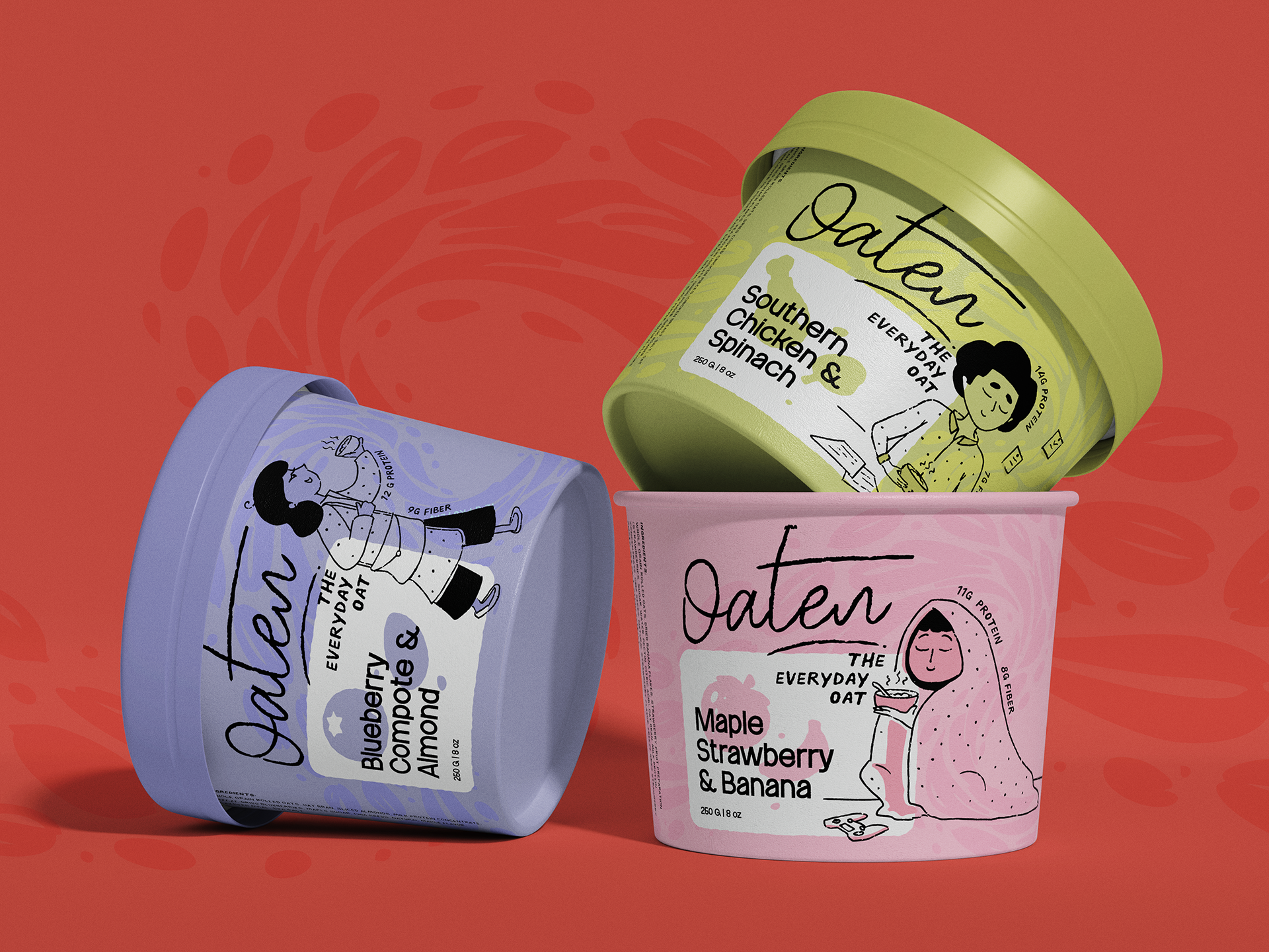
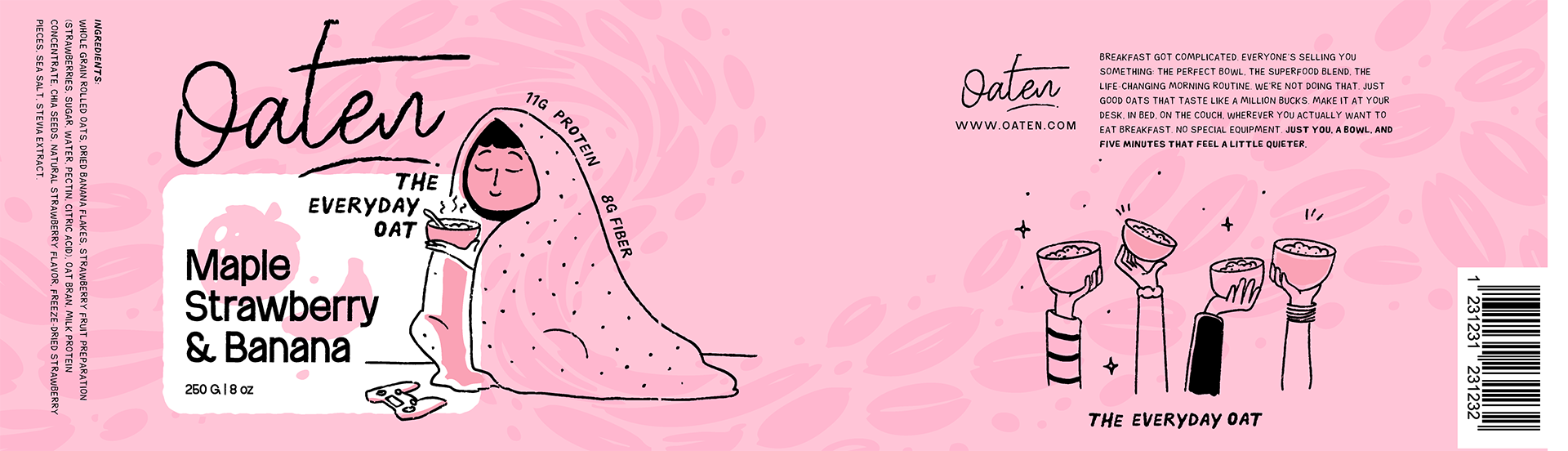
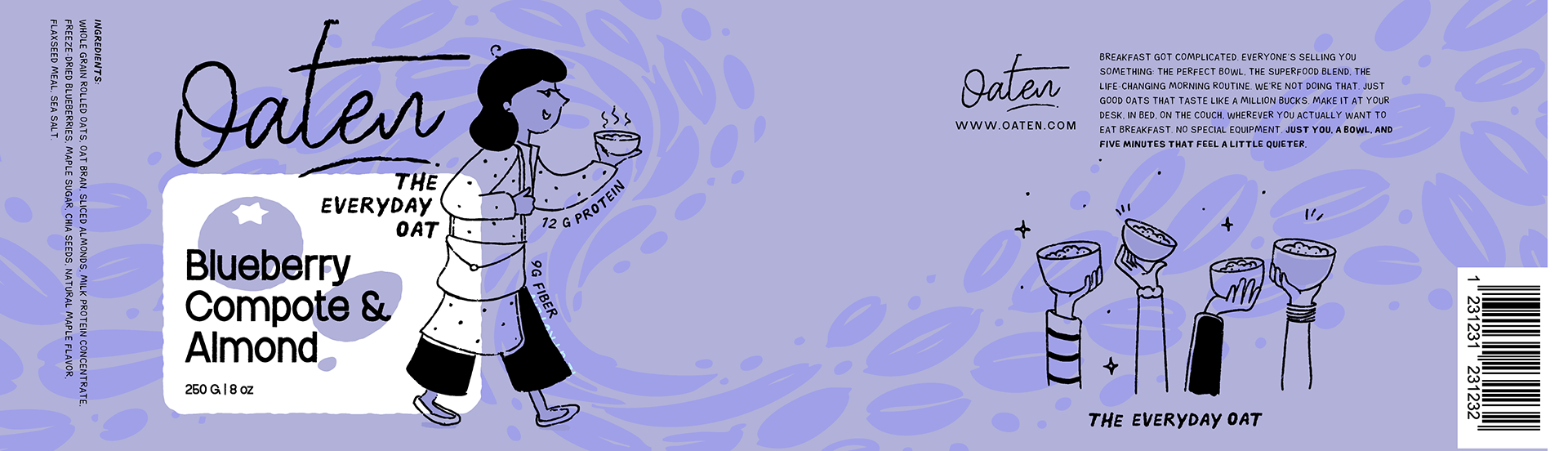
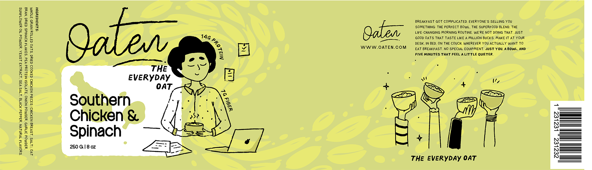
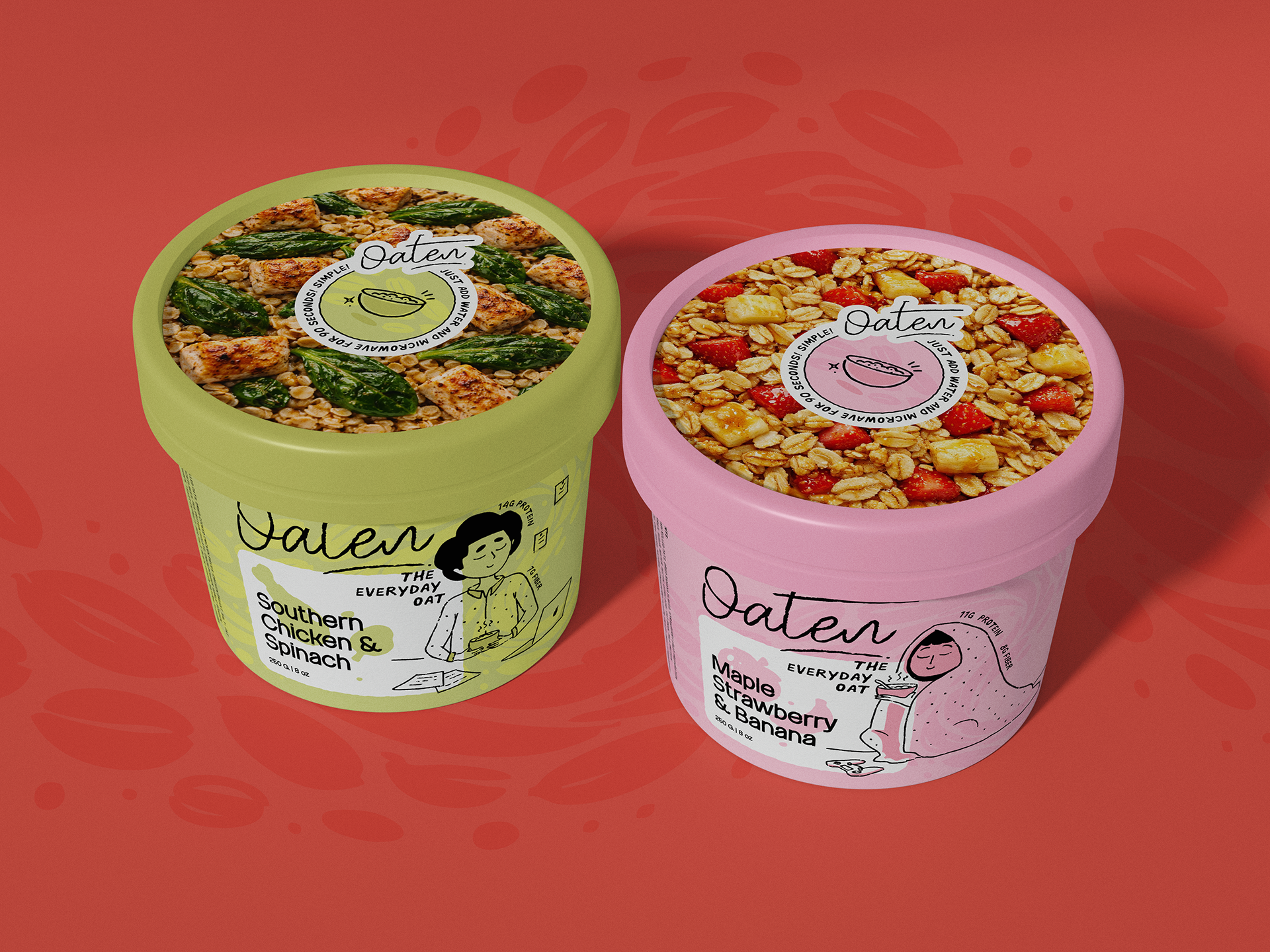
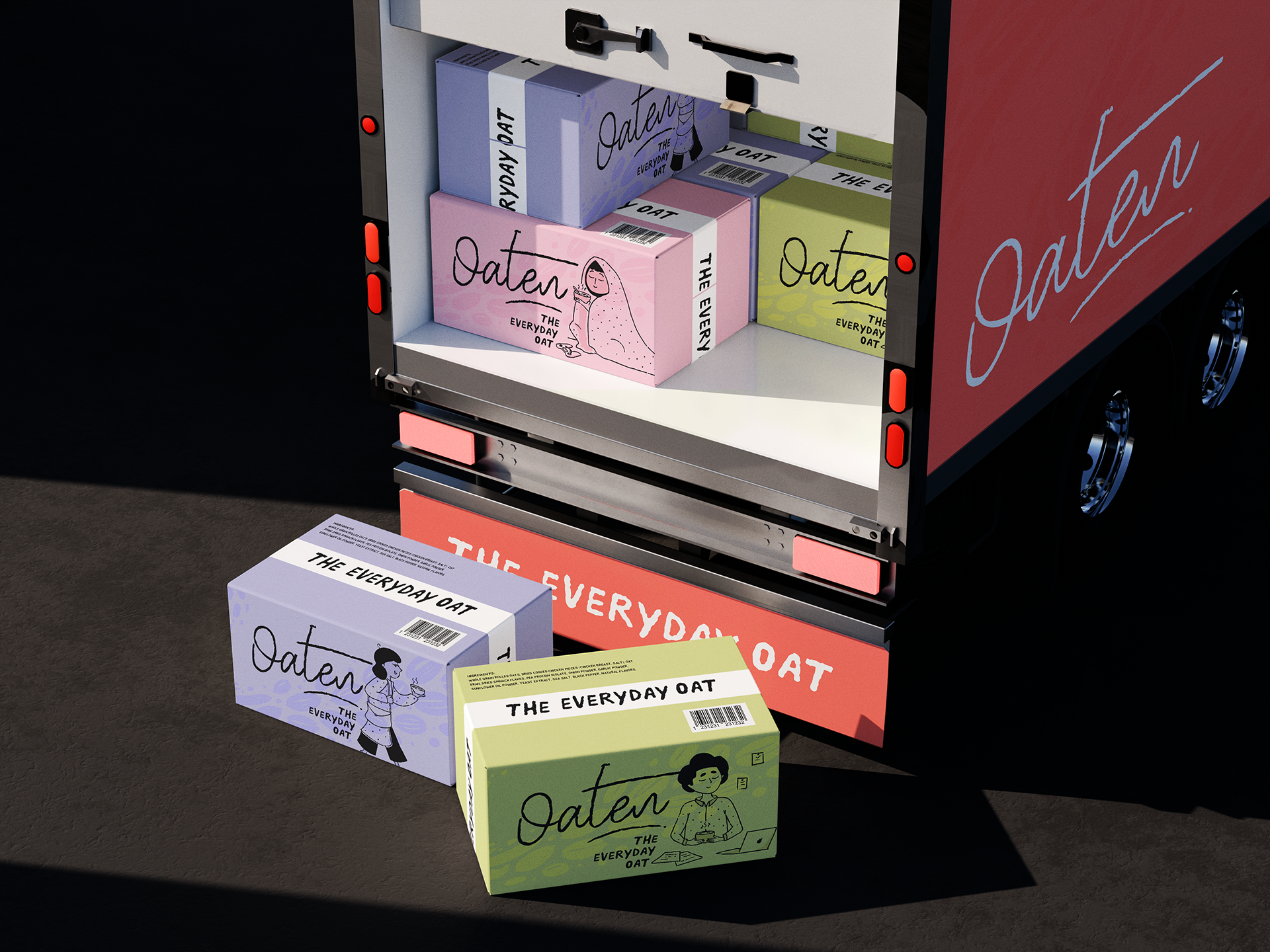
Oaten is a porridge brand for people tired of breakfast being a whole thing. I built the identity from scratch - logo, color system, typography, and packaging across three flavors. The cup format takes its cues from instant ramen. Fill to the line, microwave, done. Illustrations show people eating in bed, at their desk, on the couch, because that's where breakfast actually happens.
Honest ingredients, no wellness theatre, and a brand that genuinely means what it says. Exactly the kind of brief I love.
OATEN - THE EVERYDAY OAT - FULL CASE STUDY


STILLS - OATEN PACKAGING